Basement
A gloomy Vancouver basement becomes a bright, inviting family space

Image: Janis Nicolay
Basement
A gloomy Vancouver basement becomes a bright, inviting family space
In North Vancouver’s Lynn Valley neighbourhood, a dark basement previously serving as a rental apartment gets a light and bright family-friendly makeover.
When renovating in stages, most homeowners start on the first floor and work their way up. Yasi and Salman Manki upended – or perhaps down-ended – that expectation by beginning the overhaul of their 2,200-square-foot home in its basement. “It was an apartment when we bought the house,” says Yasi. “But renting it out didn’t appeal to us.”
Instead, they imagined the 1,000-square-foot space as a family room to enjoy with their two boys (Asha, 6, and Zayn, 4) and a spiffy spot for family and friends to spend the night. “We envisioned something bright, warm and welcoming with a Scandinavian touch,” says Yasi.
To turn that vision into reality, the couple entrusted interior designer Clair Parke, with whom they’ve been friends for almost 10 years. “I intuitively understand their style,” says the designer. But it didn’t take intuition to clock the less-than-desirable state of the space. “It was bad,” says Clair. “There was brown everywhere along with musty worn carpeting, and the bathroom had a turquoise toilet, tub and sink.” Producing Scandi serenity would require more than just a few new furnishings.
Clair oversaw the two-month reboot, which included demolishing the bathroom – ditching its clunky tub in favour of a sleek walk-in shower – and ripping out the kitchen to make way for a home office.
With the new layout established, Clair turned to the finishes and furnishings, starting once again from the ground up. “I chose white oak floors for the living area and bedroom to keep the look light,” she says. “They were my jumping-off point for the whole look of the place.” Bright white walls complete the envelope, which is anything but stark thanks to the furnishings.
“I channelled that spare yet warm Scandi vibe,” says Clair, who layered in textural elements like sheepskin throws, nubby blankets and woven rugs. Pale wood items, such as the entryway bench and the living room’s custom mantel and hearth, keep the palette airy. But it’s not all monotone: “Everywhere you look, there’s a pop of dark grey or black – even if it’s just a hook on a wall – to add a bit of energy,” says the designer.
The Mankis love it so much they’ve hired Clair to revamp their main floor. And now, they can camp out in their snazzy new basement while the design transformation continues onward and upward.

Though non-working, the fireplace is still a fabulous focal point. “When we removed its existing insert, which had an ugly gold trim, I discovered this beautiful arching opening,” says designer Clair Parke. “I painted it charcoal grey to accentuate the shape and then added candles for a fire effect.”


Clair describes the room as a “study in texture,” from the painted exposed bricks and woven sisal rug to the smooth leather buttery chair. It’s practical, too, boasting a comfy sectional with dark upholstery and a wipeable coffee table. The TV is hung opposite the window for a simple, balanced look that isn’t obtrusive.

The entryway’s white walls are punctuated by black accessories, and its straight lines are softly tempered by the round mirror. “You enter the house on this level and have to go upstairs to the main living area,” says Clair. “It used to be dark and dingy, but now it feels welcoming and purposeful. It grounds the house in a way.” The outstretched-hand hooks add a bit of practical whimsy, while the rug lends a jolt of texture that feels decorated rather than utilitarian.

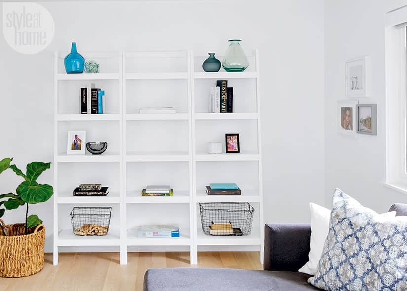
An open shelving unit provides functional storage and a place to display accessories that introduce colour and visual interest.

Layered tonal patterns (seen in the framed hand-dyed linen artwork above the bed and the white-on-white perforated basket light) add interest without detracting from the guest room’s serenity. The dyed sheepskin rug, cozy throw and fabric artwork are nods to Scandinavian hygge.

Clair kept this corner of the bedroom as it was. “This funny little indentation is across from the bed. Instead of filling it in, I embraced it and added shelves to create a space for books and guests’ belongings,” she says.


“I wanted a spa-like bathroom, and Clair made it happen,” says homeowner Yasi Manki. It has a luxe look but didn’t break the bank thanks to Clair’s savvy budgeting, which included using porcelain tiles instead of marble ones, and a high-end-look floating vanity that’s from a big-box store. “It’s wall mounted, so it takes up less visual space, which is key in a small bathroom,” says Clair.


Comments